1MDM

1mdm building

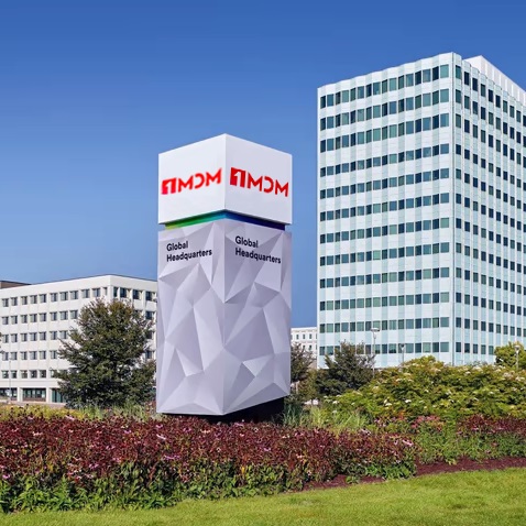
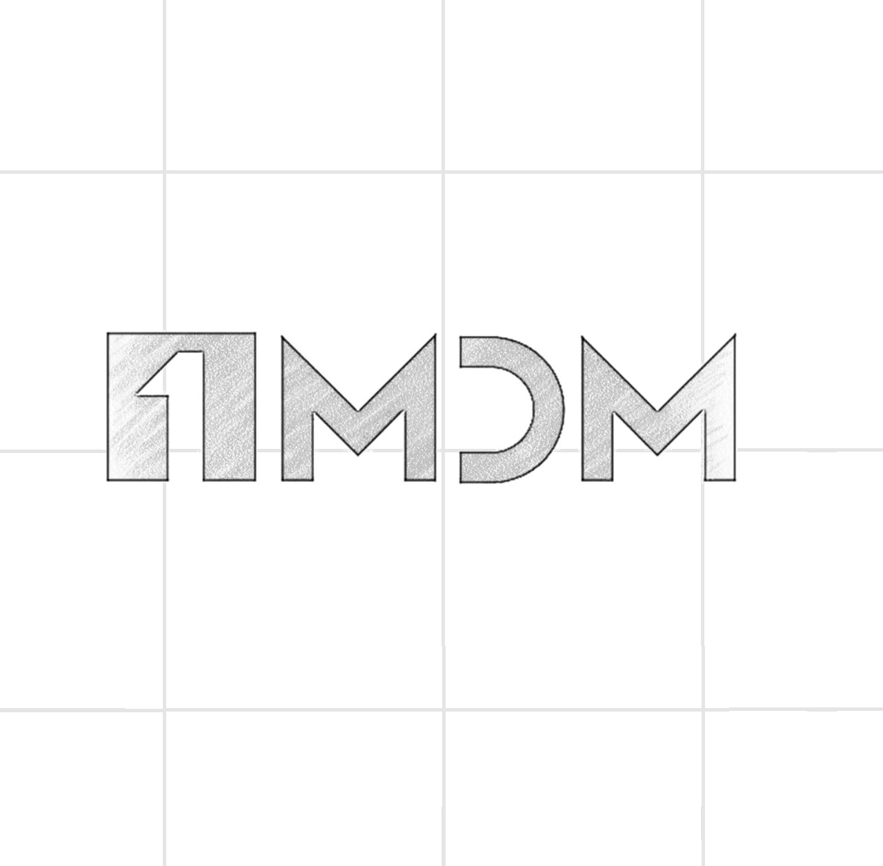
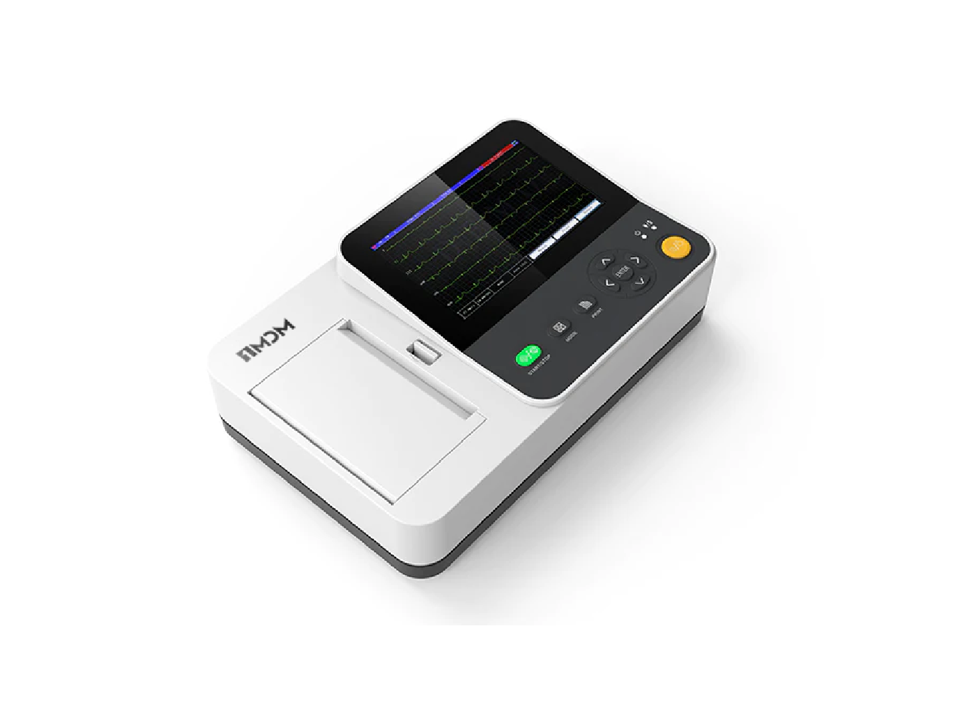
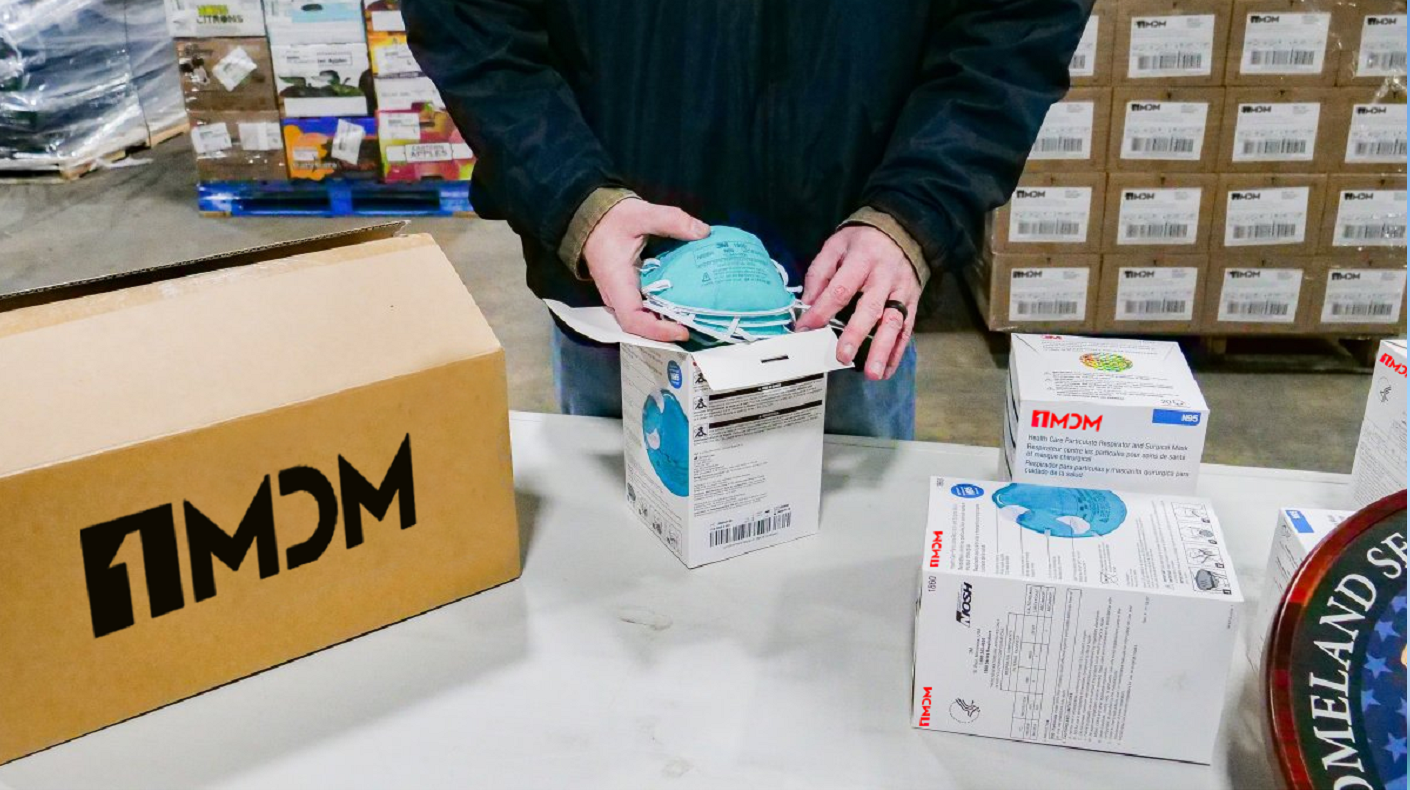
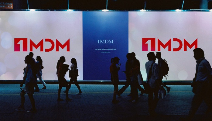
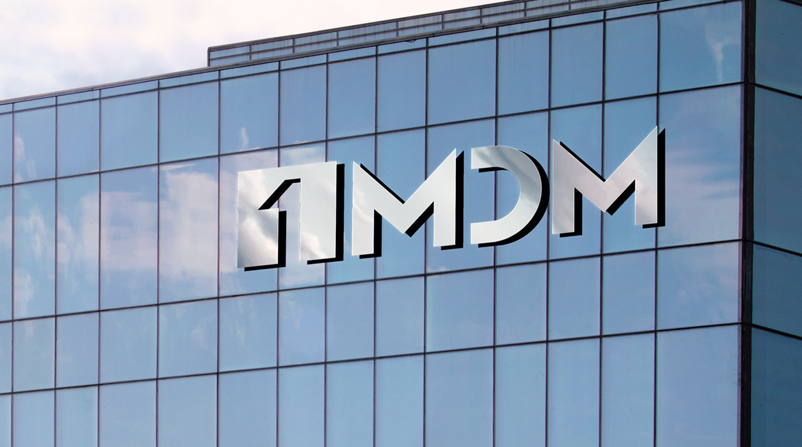
1MDM's visual identity was choosen as a word mark to help speread awarness for the marketplace. Minimal visuals with simple font & a hint of gradient. 1MDM one of the world's largest online marketplace for life saving medical devices.

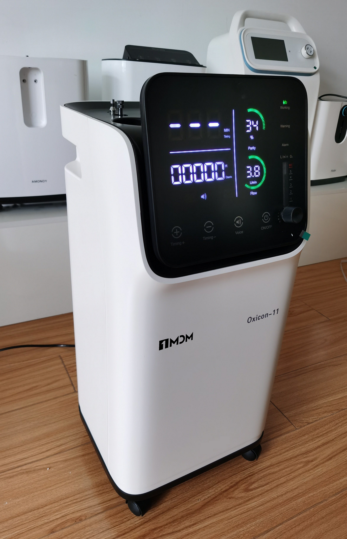
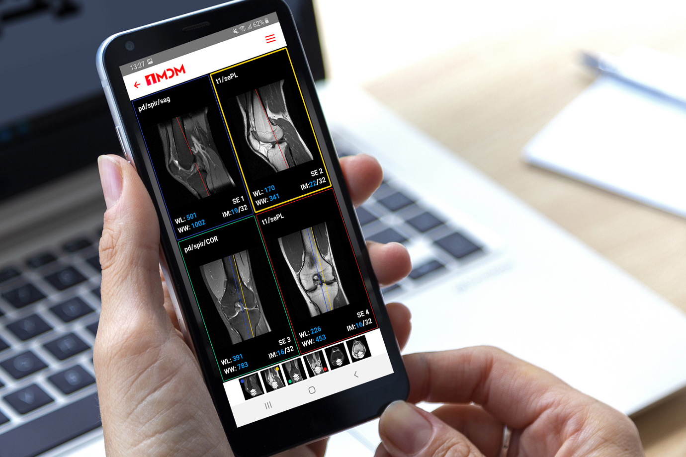
1MDM's mission is to make life saving devices accessabile worldwide with over 100k products on it's market place.
The word mark will create awarness & become the bridge for many manufacturers, hospitals & everyday users worldwide.

The red & grey stripes is abstract but not without meaning. It symbolises momentum, moving forward & up, equality with a very modern aesthetics. These are built into the qualities of the firm by extention of the same notion. The upward degrees give the motion of going up as well but ultimately remains very simple.

The mark has been now incorporated to the core of the brand and although wasn't immediatly striking, which wasn’t surprising. However, within months of the adoption of the identity, the abstract symbol has widely accepted across the company and actively adapted into more of the companies merchandise.

1MDM Lab coat

The symbol's wide acceptance is only growing over time with more people coming to recognize the abstract mark. It also serves as the first visual interaction to SuperLabs products & services across the board.

Logos


Circle Realty Logo

Circle Realty Logo Identity Program

1XRA Logo

1XRA Logo Identity Program

Kntag Logo

Kntag Logo Identity Program

Cookfiniti-logo

Cookfiniti Logo Identity Program

Paisebae Logo

Paisebae Logo Identity Program


Where will your career take you?


Come Find Out Now


What can we help you achieve?


Let's Get To Work