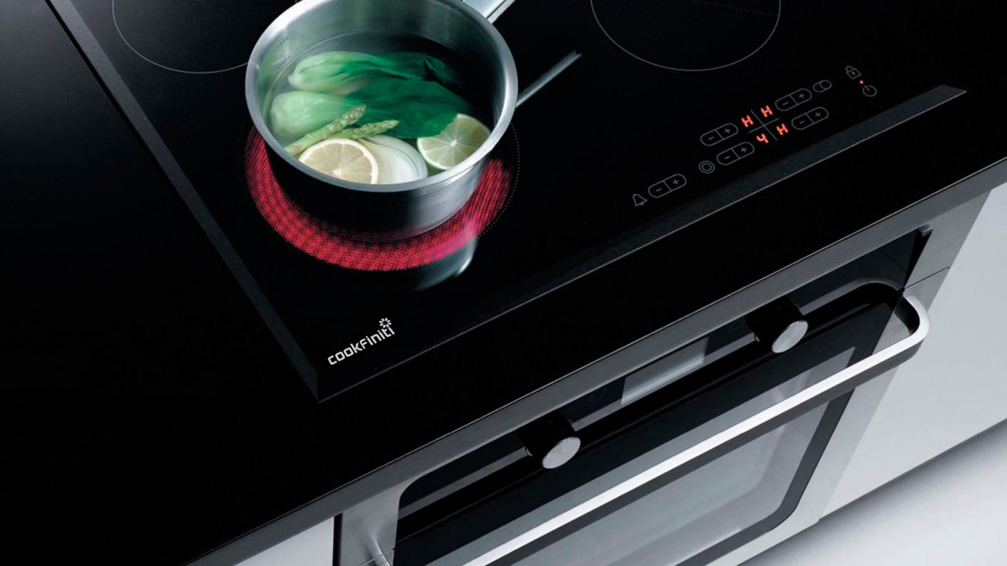
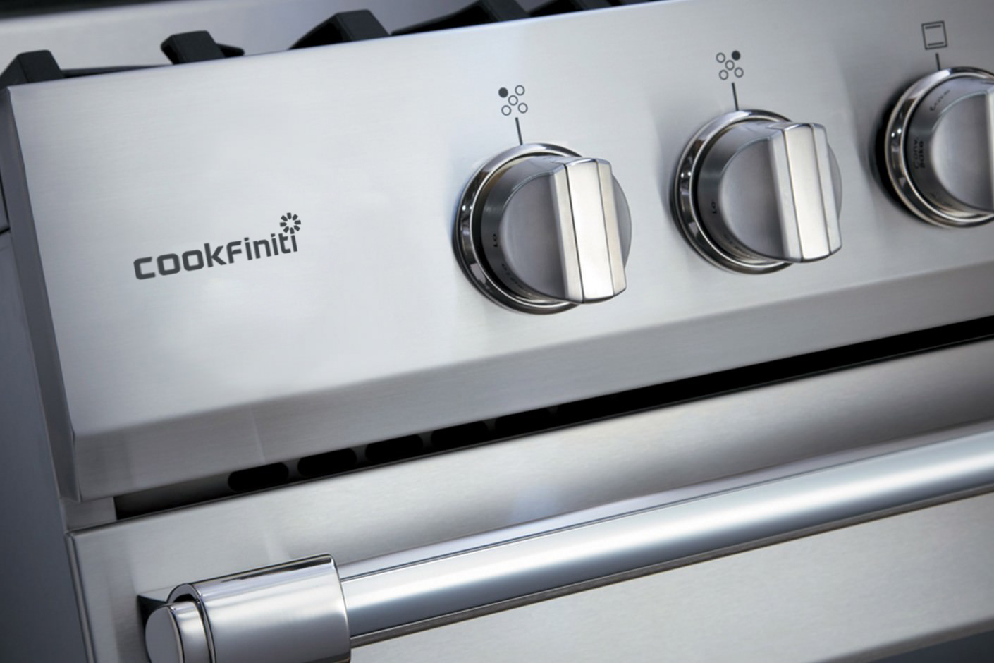
Cookfiniti

The SuperLabs new logo freshely made in 2022, as the brand need to set the tone for clean & simple new astestic for the modern era. SuperLabs is founded in Coimbatore.

The firm is the expiremental ground for many products incubated from scratch across various sectors, the professional services firm works across spectrum of engineering to technology as a solution provider for both hardware & software.
The new abstract symbol will be at the forefront of the companies brand for millions of it's new users, customers, employees & the general public.
The red & grey stripes is abstract but not without meaning. It symbolises momentum, moving forward & up, equality with a very modern aesthetics. These are built into the qualities of the firm by extention of the same notion. The upward degrees give the motion of going up as well but ultimately remains very simple.

The mark has been now incorporated to the core of the brand and although wasn't immediatly striking, which wasn’t surprising. However, within months of the adoption of the identity, the abstract symbol has widely accepted across the company and actively adapted into more of the companies merchandise.

The symbol's wide acceptance is only growing over time with more people coming to recognize the abstract mark. It also serves as the first visual interaction to SuperLabs products & services across the board.

Logos


Circle Realty Logo

Circle Realty Logo Identity Program

1XRA Logo

1XRA Logo Identity Program

Kntag Logo

Kntag Logo Identity Program

1MDM Logo

1MDM Logo Identity Program

Paisebae Logo

Paisebae Logo Identity Program


Where will your career take you?


Come Find Out Now


What can we help you achieve?


Let's Get To Work